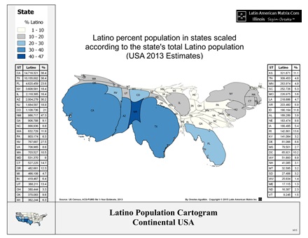
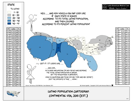
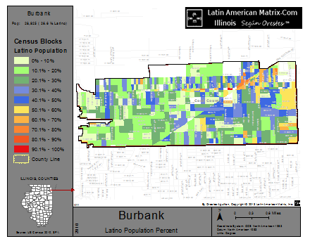
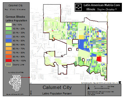
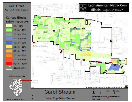
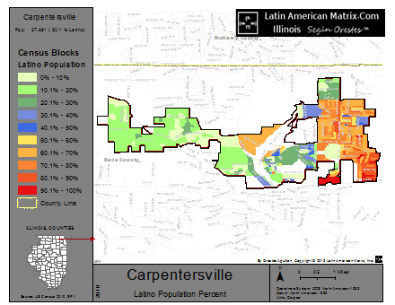
If you are on deck for delivering a presentation comparing Latino populations in the U.S. — and quickly need to find a good slide-image to drive your points across — you can now download a sample of our Latino Population cartograms. With it, you can compare and contrast the magnitude of Latino populations in the U.S. in ways that are more memorable and informative.
For formal presentations, such as for conferences and panel discussions, download the slide-optimized version of the image shown below at: http://latinamericanmatrix.com/state/4099115009-1.html
——
Likewise, for informal presentations, such as for classrooms, interactive trainings and brainstorming meetings, download the slide-optimized version of the image shown below at: http://latinamericanmatrix.com/state/4099115011-1.html
—–
By the way, these cartograms are also available in Spanish and/or in PDF format.
Have a great presentation!
——
P.S.: If you need custom-made cartograms for your next presentations, please contact us. We can craft cartograms for any possible socio-demographic trait, and for any possible geographic area. We can process raw data from public data sources (such as the U.S. Census) or from your own data-sources (such as your clients’ database.)
Let us be part of your next speech preparation team!


Leave a Reply
You must be logged in to post a comment.